| 标题 | Tillamook - Visual Identity System |
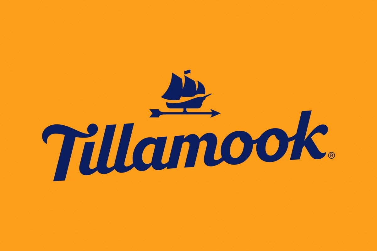
| Brief | A heritage-inspired wordmark conveys a touch of nostalgia. Its bold use imparts a fresh modernity. The Morning Star ship, a historic symbol of innovation, is redrawn and liberated. Reimagined as a barn-top weathervane, it now provides a meaningful link between the past and the today’s continuing farmer-focus. The packaging design system has a consistent architecture and color system, creating impact and easy navigation at shelf. The tonal barn roof stages the wordmark, icon and variant story. |
| 广告公司 |
Turner Duckworth
|
| 广告战役 |
Tillamook - Visual Identity System
|
| 广告主 |
Tillamook Country Creamery Association
|
| 品牌 |
Tillamook
|
| Posted | 11月 2019 |
| 行业领域 | 奶制品和鸡蛋
|
| 剧情简介 | With over 100 years of local heritage, Tillamook is a beloved icon in the Pacific Northwest, USA. National expansion, product innovation and an increasingly competitive landscape prompted the most significant redesign in 60+ years. The challenge, to unite an array of offerings within a timeless, cohesive system that would make an entrance in new markets and allow for new product offerings while staying true to its roots. A wordmark inspired by history, an icon to celebrate the unique Morning Star story, and a bold approach to system design that conveys flavor, variety and modernity at every turn. |
| 媒体类别 |
Corporate/Brand Identity
|
| 创意总监 |
Jamie McCathie
|
| Design Lead |
Nicole Jordan
|
| Implementation Director |
Liisa Turan-Walters
|
| Implementation Designer |
Sara Scanlan
|
| Lettering |
Jeremy Mickel
|
| 文案 |
Colin Corcoran
|
| 摄影师 |
Maren Caruso
|
| Agency Director of Production |
Craig Snelgrove
|
| Lead Production Artist |
Jeff Ensslen
|
| 客户总监 |
Sam Brown
|